
You've set up your homepage so it's visually stunning and reflects your brand. You launch the site, and promote it, and yet… crickets. Even with traffic, no leads are showing up. Your website's homepage now seems like a sports car without an engine: it might look great, but it's not getting you anywhere.
It's a problem we see all the time: people get carried away wanting to put everything on their homepage, rather than prioritize the elements that quickly communicate your value to visitors, build trust, and guide them to the next step in the customer journey.
Whether you’re wondering what type of website homepage content you need, or you’re planning a new website and want to avoid wasting your money, you’re in the right place.
In this series we're providing you a roadmap for transforming your website into a high-converting marketing asset, and that starts with nailing the essential sections of a website homepage.
So what should be on a homepage? How should you approach it?
First, understand who's seeing your homepage
Not every website visitor is going to land on your homepage. Traffic comes from so many places these days, but for those who land on the homepage first, it's your moment to shine.
Most frequently, this is the type of traffic starting on your homepage:
- Organic search traffic, where visitors find your site through searches that match your content or services. These people are actively searching for what you offer, making their readiness to convert higher, but their initial trust is low.
- Direct traffic, where visitors have manually entered your URL, bookmarked your site, or clicked on an email link. Some of this may be new word-of-mouth traffic (which lends you some early credibility), or they're returning users. Either way they might already have an idea of what you do, and they want
- Referral traffic comes from links on other websites, social networks, or external sources excluding search engines. It's driven by backlinks in contextually related content, so it caries some basic credibility, and potentially pre-existing interest in your offerings.
While these are 3 different "audiences," the goal of your homepage boils down to this: It needs to grab their attention fast, showing what you can do for them, why you're the best option for their situation, and what they should do next.
Considering how many visitors won't even scroll down, the top of your homepage needs to do some heavy lifting. And that starts with writing effective copy.
1. Use copy that speaks your customers' language
Nothing makes a customer's eyes glaze over faster than brandspeak about "innovation" and "solutions" and "synergy," and this holds equally true with B2B customers. When have you ever heard one of your customers talk like that?
From your headlines and subheads to the descriptions throughout, your copy (as in the text on the page) is a major part of your visitors' first impression of your company, addressing their needs, desires, and questions — questions such as:
- Is this for me?
- Will this solve my problem?
- Do I care enough to learn more?
- Does this address my objections?
- Does this company look trustworthy?
The descriptions and blurbs throughout your homepage should concisely communicate to your audience what you’re offering them. That means not only describing the product or service, but the benefits to the customer, and why you specifically are the business to purchase from.
So what makes for compelling sales copy that engages and converts?
- Write clear, compelling headlines: The headline sets the tone for your homepage, offering a promise that intrigues and motivates readers to explore further. In other words, it's the most important piece of copy on your homepage. Keep it at about 6-10 words and make sure the reader immediately knows they're in the right place.
- Focus on the offer's value: Emphasize what your audience gets from your product or service. Highlight the specific benefits and how these benefits address their problems or enhance their lives. Remember, the value proposition should be clear and customer-focused.
- Simplicity and relevance: Keep your copy simple. Avoid overcomplicating messages or trying to get too clever. Ensure every word and sentence serves a purpose and relates directly to your audience’s interests and your product's benefits.
- Direct attention with strategic formatting: Make use of formatting tools like bolded text, bullet points, and strategic breaks in sentences. These elements help guide the reader’s attention to the most important parts of your message.
Getting your headline copy right
Many people won't ever scroll down on your homepage, so everything they see when they arrive on your site (everything "above the fold") has to do about 80% of the heavy lifting. That means few things are as important as your headline and subhead.
Below are two different but strong approaches to headlines. Slack focuses more on the benefit and evokes curiosity, before elaborating with the subheading. Meanwhile, Dropbox opens with social proof right in the headline, before similarly giving their value proposition in the subheading.
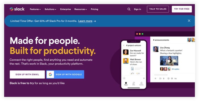
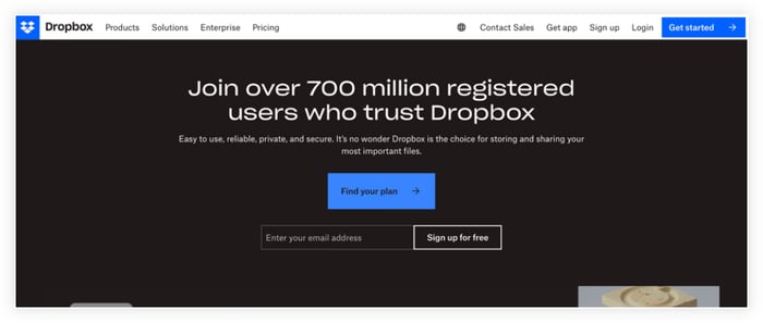
You might notice an issue here: unless you're a very well-known brand, your headline should generally help the visitor quickly get a sense for what you do. Neither of these examples does that, but they both nail the subheading, which brings us to our next point.
Use strong subheadings
Your subhead (or H2) is your second-in-command: it supports and amplifies the message of your headline. Use subheads to describe your offering directly and highlight key benefits, like time-saving or efficiency improvements.
- Your primary subhead (sometimes a couple sentences of description) is up by your headline at the top of your homepage, and is the most important. There are a ton of ways to get this right so, but it’s easy to get it wrong, too. Use this text to clarify what customers can do with your product — a visitor shouldn't have to scroll down to figure out what you offer.
- Your other subheads will be be titles for the sections on the rest of the page. For many visitors, this is the only text they read below the fold, so avoid generic subheads like "Solutions" and use more descriptive text like "How we help [target audience] get [outcome]."
Subheads are often an opportunity to incorporate customer quotes from testimonials or reviews. Let's dig into that next.
2. Let your past customers do the talking
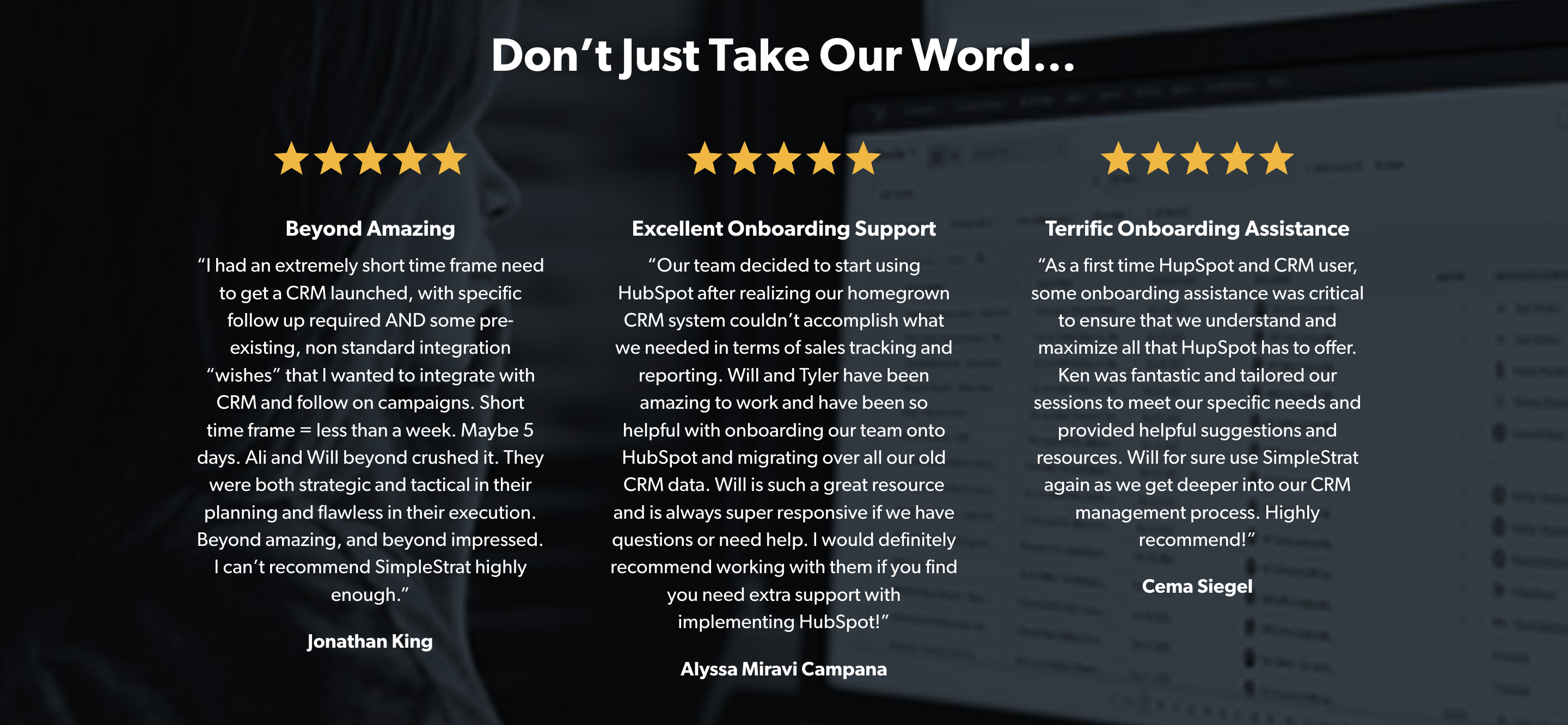
Add in some elements of "social proof," such as testimonials, customer reviews, endorsements, clients you've worked with, as well as any awards or certifications. This builds trust and credibility, showing potential customers that others have benefited from what you offer.
It's these stories, told in their own words, that resonate most with your visitors – they're not just looking for endorsements, they're looking for experiences they can relate to and have their concerns addressed. This helps establish your credibility
A few things to bear in mind before you get started:
- There are exceptions to having testimonials on the homepage: If you have multiple products or services, a testimonial for product A might confuse a potential customer for product B. In these instances you may want to save testimonials for your landing pages, or add more generalized testimonial to your homepage, like a short quote about your team.
- Ask customers to share their experience: When you're asking for testimonials, sometimes it helps to ask customers about specific experiences that other potential customers would want to hear about. Maybe they had reservations or objections and discovered they had nothing to worry about. People want to be reassured!
- Prioritize video, but other styles help too: Videos are more relatable and personable than plain text, which makes them easier to trust. If a video testimonial isn't in the cards, a photo with a quote can still add that personal touch. And if privacy's a concern and a face to the name isn't possible, try to at least include their name and company. to lend some credibility. It's not possible for every industry, but the more "real" the customer comes across (i.e. you can hear them and see them), the more trustworthy it feels to visitors.
3. Include clear CTAs for obvious next steps
What do you want your visitors to do when they visit your site? If it's not crystal clear to you, it definitely won't be for your website visitors either.
Strong calls to action (CTAs) are pivotal in converting website traffic into tangible outcomes, such as sales, sign-ups, or downloads, directly impacting the success of your online presence. For instance, with the Dropbox and Slack examples earlier, you could instantly see what they want their visitors to do: sign up.
Well-crafted CTAs can significantly boost conversion rates, making them essential tools for achieving your digital marketing goals. So what makes a great CTA?
Make CTAs clear and specific
Strike a balance between informative and concise to keep the CTA clear but not overwhelming. Make sure the value proposition is apparent.
- Use direct, concise language like “See upcoming events” or “Sign up for free” or "Start free trial" to eliminate ambiguity.
- Incorporate time-sensitive phrases such as “Register now” to create a sense of immediacy.
- In most cases, you'll want to get even more specific about what they're getting by clicking, like "Claim my webinar seat now" or "Increase inbound leads by 40%"
If you have the traffic (or lacking that, the patience) for it, A/B test your CTAs to determine which variation works best. As mentioned above, HubSpot makes this easy with their CMS Hub.
Don't hide your CTA
Ensure your CTA stands out, with contrasting colors, bold text, or unique shapes. It's common (and effective) to put a bright orange CTA in the top right of the page, usually in the nav bar. Either way, place them prominently where users naturally focus, and ensure they are large enough for easy interaction, especially on mobile.
Consider using some extra copy to support the CTA when it's on the page
In most cases you can support a CTA button with relevant copy next to it (such as with the Slack example below). For instance, you can use questions paired with your CTAs to make them more personal and relatable, like “Ready to boost your productivity by 3x?”
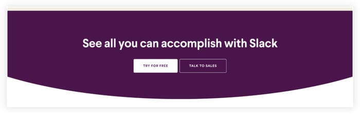
While the buttons themselves are pretty minimal in this example, the supporting text helps clarify what the buttons don’t say. If you’re a SaaS company and offer a free tier or free trial as your starting point for the customer journey, the word “free” is important to include here.
Remember to keep it focused on the customer benefit. Highlight what users will gain, e.g., “Download Your Free Ebook and Start Learning Today!” instead of just “Download.”
Exceptions
Generally all the CTAs on a page should be pushing the visitor towards the same thing, but there are some exceptions, such as when dividing audiences based on different segments.
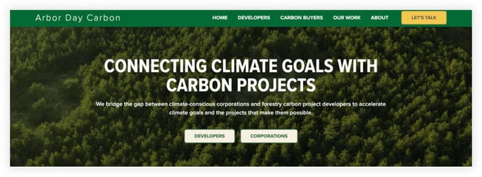
Homepages are another exception to the "one CTA only" rule, because every type of customer is starting there (and in some cases your suppliers or vendors), so you want to quickly point them to the right page.
For instance, Arbor Day Carbon’s website below quickly explains how they connect their two audiences, and then provides a path for each audience to follow. These aren’t CTAs per se, but they lead to pages that are drastically different for each audience.
Meanwhile, the bright “Let’s Talk” CTA in the menu bar is sitewide and allows visitors to reach out when they’re ready, without excess clicking around.
Similarly, continuing with the Dropbox example, they provide tailored copy depending on how you plan to use it, where each section focuses on how each of the two audiences might use it. Each area of copy then supports the relevant CTA.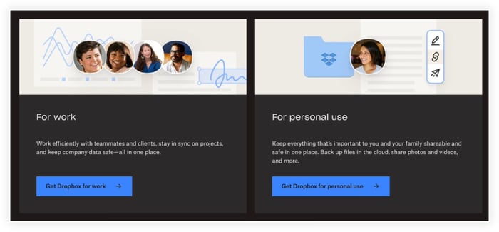
Consider a Secondary CTA
Another exception to the "1 CTA maximum" rule is if you want to set up a secondary "downsell" style CTA. This secondary CTA is a softer ask compared to the primary one, targeting visitors who aren't ready for a bigger commitment.
For instance, if your primary CTA is "Schedule a Call," a secondary CTA could be "Download our Free Guide," because it's a much smaller commitment.
Adding a secondary CTA can broaden engagement by appealing to visitors at different decision stages, but it risks diluting the primary CTA's impact and potentially lowering immediate conversion rates as some visitors may opt for the less committal secondary option.
You're still getting their contact information though, so if you have a strong nurturing process through your buyer journey, it should all even out (at worst). The best method here will depend on how you typically acquire customers.
4. Use an intuitive design
More important that mere appearance is user experience (UX). Your homepage is a stepping stone to the visitor's next interaction with your business: it should be intuitive, welcoming, and informative, guiding visitors naturally towards the actions you want them to take, whether it's making a purchase, signing up for a newsletter, or simply learning more about your services.
So what are some homepage design best practices?
Clean and functional appearance
Yes, looks still matter, as long as they're not taking priority over function. Choose colors, fonts, and images that are not only attractive but also reflective of your brand's personality. The visual elements of the page should work together to kick off a cohesive and pleasant browsing experience.
The choices you make here should be consistent through your site as well. A blog page with a completely different style from your homepage won't inspire a lot of confidence.
Use relevant images and/or video
Consider the hero image or video — a striking visual or video at the top of your homepage that encapsulates your brand's essence or value. Whatever you choose to put there, make sure it's actually relevant to what your business does. Showing your team, or your product in action? Perfect. Showing some pretty mountains when your company sells software and is based in a coastal city? Not so much.
Ditch the stock images
The design and copy on your homepage should work hand in hand. While the design creates the first visual impression, the copy provides context and persuades the visitor to take action. Make sure the images and text are both providing value to the reader, whether that's a helpful graphic or showing them the faces of your team.
Make it easy to navigate
A well-structured navigation menu is also crucial. It should be straightforward and logical, enabling visitors to find what they are looking for with minimal effort. A visitor should never have to pause and think about how to find what they're looking for.
Homepage design example: Apple
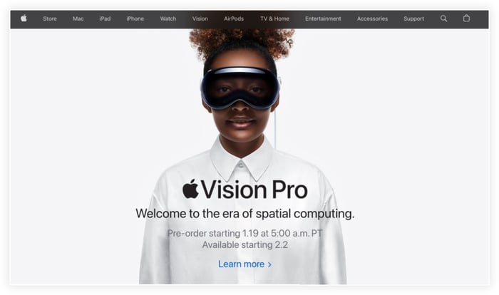
Since Apple has always been particularly focused on design and user experience, let’s use them as the example. If you’re heading to their website in 2024, you’re already well aware who Apple is, so you don’t need an intro.
Instead, they introduce their latest product. Meanwhile, the menu bar allows you to easily navigate to all of Apple’s primary products and services, along with a Support tab. Almost all of these tabs have a dropdown menu that let’s you get more specific about what you’re looking for.
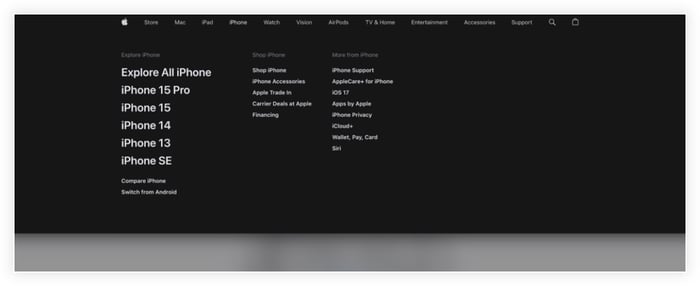
This concept shouldn't really change with B2B either. If your menu has multiple tabs and dropdowns, it should all follow a clear and logical hierarchy.
Make it easy to engage with you
Include elements where visitors can easily provide feedback or get in touch with you. This could be through a contact form, chatbot on your site, or social media links. First-time visitors might not have much a reason to connect with you via email or social, so consider a "lead magnet," also known as "gated content" — a downloadable file like an ebook or in-depth guide, which visitors can access in exchange for their email address.
Reminder: Having a customer email address is a privilege, so don't abuse it by sending tons of emails or asking for a big purchase right off the bat. And keep your marketing emails compliant!
Don't forget the technical stuff
- Make it mobile friendly: With the variety of devices used to access websites today, your homepage must adapt seamlessly to different screen sizes and resolutions, ensuring a consistent experience across all devices.
- Keep it quick to load: Visitors are likely to leave a site that takes too long to load, so a fast-loading homepage is essential. Optimize images and scripts to ensure quick load times.
- Follow accessibility standards: Design your homepage to be accessible to all users, including those with disabilities. Accessibility standards include readable fonts, alt text for images, keyboard navigation, and descriptive anchor text for links (i.e. don't use "click here").
5. Optimize your homepage for search engines (SEO)
Homepages are the core of your site, and they have the highest potential to rank in search. Keeping that in mind, if you follow all the tips about helpful and descriptive copy, you're off to a great start, because Google/Bing will find your site more relevant to your target customers, and give it a better placement in search.
With AI on the rise, some marketers doubt the future of SEO as we know it today. Yet SEO remains vital, and its demise will be much slower than you might expect. AI will still need to pull its information from somewhere (not just its training data), and as linked citations become more common in AI responses, you’ll definitely want your website to be the source getting cited.
With that in mind, there’s a lot more to SEO than just throwing some keywords into your page, and more than we could hope to fit in an article of this scope, but here are some high level things to keep in mind if you want to increase the chances of your homepage appearing at the top of search results:
- Keyword strategy: Choose relevant, less competitive keywords, including long-tail phrases, to improve search rankings while maintaining content quality. Tools like SEMRush or Google Keyword Planner can assist in finding suitable keywords. Ideally, you can fit your main keyword into your headline or subheading.
- Content Quality: Keep homepage content engaging and up to date. Use header tags effectively, placing primary keywords in H1 and secondary in H2s and H3s.
- Loading speed and mobile optimization: Fast loading speeds are important for ranking and user experience. Tools like Google PageSpeed Insights can identify speed-boosting opportunities. A responsive, mobile-friendly design is essential for catering to the majority of users who browse on mobile devices.
- Internal linking and user engagement: Incorporate internal links to guide visitors to other site pages, aiding in search engine crawling. Elements that promote user interaction, from content that makes them explore more pages in the site, to contact forms or comment sections, can positively impact SEO.
- Performance monitoring: Regularly use tools like Google Analytics to monitor traffic performance. These analytics tools integrate easily with most website hosting platforms, though platforms like HubSpot CMS also provide their own robust analytics. Whatever you use, be sure to adapt and update your strategies based on user behavior, traffic sources, and keyword effectiveness.
6. Feature some of your popular content
Speaking of SEO, high-quality content is the fuel that not only drives your organic traffic, but also helps build relationships with your prospective and current customers.
Blogs are a tried and true content strategy for this. On our homepage for instance, we like to have a few blog posts featured. This setup creates a gateway to showcase your expertise and engage visitors, where they can more easily discover it when they aren't actively searching. Put some of your more popular content there, answering common questions or sparking your audience's curiosity.
Video content is another powerful way to build relationships with potential customers. Since new visitors often aren't immediately ready to make a purchase, featuring valuable content helps build trust and credibility. This encourages visitors to explore further, increasing their likelihood of returning and eventually converting into customers.
For instance, we provide tons of video content about HubSpot on our HubSpot Hacks YouTube channel (which has videos featured on many pages on our site) as well as recurring webinars to help both leads and clients better understand the platform. This also helps demonstrate credibility for our HubSpot services, such as setting up high-converting websites on the HubSpot CMS.
7. Make sure your backend is managing leads
When your homepage is optimized to build trust with visitors and capture leads, you still need a system to handle all those contacts — preferably a system that's going to make your work easier, rather than creating more work for you.
When it comes to powerful platforms to run websites, we’re passionate about HubSpot (hence why we’ve got the whole YouTube channel of tutorials about it).
HubSpot integrates your CRM and content management with just about every aspect of your business. This ensures a seamless user experience and gives you sophisticated analytics capabilities that can change the way your team makes decisions. Pair that with HubSpot's AI-assisted tools, and you can easily to build, update, and edit your pages, resulting in a clean and optimized website that gives your customers what they're looking for.
If you’re building a new website for your business (or need to update your old one), you’re well-positioned to get started with HubSpot. At Simple Strat, we specialize in helping our clients get the most out of HubSpot, providing custom design, seamless migration, and comprehensive support. We focus on aligning with your business goals to a responsive, user-friendly, and effective online presence.
To find out more about our HubSpot-based Website services, and see examples of our past work, learn more here.
