

You've put in countless hours, effort, and resources into your website, expecting it to be a lead-generating powerhouse. Yet, despite your best efforts, the leads are just not coming in. You might even have some decent traffic, but if none of it’s converting, what’s the point?
The lack of leads means missed opportunities, potential revenue slipping through your fingers, and the unsettling question of what you might be doing wrong.
Unfortunately, we’ve seen many companies with nice looking websites but it’s apparent there wasn’t a clear enough strategy for the site beyond the look and feel. In other words, the way you present your company, the path your customers go through your site, and how that lines up with their pain and how they view your solution is the ticket to more leads. You need to have a clear idea of a potential customer's entire experience from the moment they land on your site, making sure it's both a pleasant and helpful experience.
That involves a lot of different factors, but let's break it down into some of the most common reasons company websites don't get the results they're hoping for.
15 Common Mistakes at a Glance:
- Confusing or Jargon-Heavy Copy
- Lack of Clear, Specific Value Proposition
- No Defined Target Audience (You're Marketing to Everyone)
- Poorly Defined User Journeys (or None at All)
- Way Too Much Talk About Features Over Benefits
- Lack of Credibility Signals
- Ineffective, Vague, or Buried Call-to-Actions (CTAs)
- Lack of SEO Best Practices (Google Can't Find It!)
- Not Addressing User Pain Points, or Being too Vague
- Ignoring Website Analytics
- No Follow-up Strategy for Leads
- Dated Design or Poor User Experience
- Terrible Mobile Experience
- Not Showcasing the Expertise or People Behind the Brand
- No Signs of Your Other Content (YouTube, Podcasts, etc)
1. Confusing or Jargon-Heavy Copy
When it comes to communicating on your website, clarity is key. Don’t fall into the trap of using complex language or industry-specific jargon, which may sound impressive but ends up creating a barrier between you and your potential customers. Note: This is often hard to spot if you’re on the inside because you may forget people don’t know what you know!
This is particularly true if your audience isn’t well-versed in your industry’s terminology. The goal is to make your content easily understandable to anyone who visits your site, so your message is immediately clear.
As a caveat, it’s fine to have the occasional technical term here and there, such as when you’re explaining something in more depth (usually not on your homepage). A thoughtfully placed term here can help establish basic expertise, as long as your reader either likely knows the term or can figure it out with the context. Don’t send readers on research missions.
How to fix it
- Simplify your language: Review your website content and replace technical terms with simpler, everyday language. If you must use industry jargon, always provide a brief explanation.
- Know your audience: Tailor your content to the understanding level of your average site visitor, and avoid assumptions about their prior knowledge of your industry. Familiarize yourself with your customers by interviewing them, or going where they go online, like forums and social media.
- Use analogies and examples: Where complex concepts are necessary, use analogies and real-world examples to make them relatable and easier to grasp.
- Get feedback from non-experts: Have people outside of your industry review your content. If they find it hard to understand, it’s a sign you need to simplify further.
2. Lack of Clear, Specific Value Proposition
If we had to pinpoint one of the biggest mistakes it would be this one and a poorly defined audience (that one’s up next).
Many websites want to say something clever on the homepage to catch attention, but with how overwhelmed today’s customer is by digital clutter and distraction, we must be crystal clear or they’re going to bounce — or worse, go to someone who IS clear. They’re not going to stop and ask questions, they’re just going to silently leave.
Here are a few common ways people get value props wrong:
- Too vague: “Amplify the sales journey” or “We offer business solutions”
- No clear audience: “Perfect for all businesses of any size or industry” (this might seem like an absurd example of this, but similar value props are way too common)
- Too much jargon: “Leveraging synergistic capabilities to drive paradigm shifts in ecosystems” (Kill me now)
- No evidence: "We are the best widget makers in the industry." (According to what, exactly? And what does “best” even mean here? Get specific!)
A clear value proposition succinctly communicates to your visitors what your company offers, how it stands out from the competition, and why this matters to them. It aligns with your target audience's needs and clearly states how your products or services solve their problems or improve their lives.
How to fix it
- Identify your target audience's core needs: Understand the primary challenges, desires, and motivations of your target audience, so you can develop a clearer idea of your ideal buyer personas. This understanding forms the foundation of your value proposition.
- It should be understood within 2-3 seconds: As with the rest of your site, use simple, jargon-free language. The value proposition should be easily understood at a glance, even when the reader’s attention is divided between your website, a Zoom call, and calming their barking dog.
- Position it prominently on your website: Place your value proposition prominently on your homepage and other key landing pages. It should be one of the first things visitors see.
- Test and refine: Use A/B testing to try out different versions of your value proposition. Pay attention to how changes affect user engagement and conversion rates.
- Use supporting elements: Enhance your value proposition with testimonials, case studies, or statistics that provide proof and build trust in your claims.
- Align with your brand's voice: Ensure that your value proposition reflects your brand’s personality and ethos. Consistency in tone and style helps in building a coherent brand image.
3. No Defined Target Audience (You’re Marketing to Everyone)
One of the key mistakes many B2B websites make is trying to cast too wide a net, attempting to appeal to a universal audience. This is a recipe for disaster — if you’re trying to appeal to everyone, you appeal to no one.
Many companies try to copy what big brands like Microsoft or IBM might do — but these companies are well established and still spend billions of dollars helping us understand what they can do.
So unless you have that type of budget (which we’re guessing you don’t), you need to cater to a specific niche or audience if you want your website to drive results.
This may be a fundamental business challenge, so in some cases it’s worth revisiting your business strategy here. Keep in mind: clarity of value and resonance with a target audience will convert more than wide nets with clever sayings, every single time.
A well-defined target audience is about understanding who your ideal clients are, what challenges they face, and how your services or products provide solutions specific to their needs.
How to fix it
- Identify your ideal customer: Start by creating a detailed customer profile. What industry are they in? What are their primary challenges and needs? Understanding these elements will help tailor your website's messaging. As mentioned above, consider creating “buyer personas” to help define this (you can use this buyer persona template)
- Research and understand pain points: Conduct market research, surveys, or interviews to gather insights about your target audience's specific pain points and expectations.
- Turn these pain points into copy for your site: You can even use customers’ own words. For instance, we found many of our clients were saying things like “my HubSpot is broken” or “we need to fix this,” which helped inform a lot of the copy for our “Fix My HubSpot” service.
- Segment your audience: If you serve multiple industries or customer types, consider segmenting your audience and creating dedicated content for each segment on your website.
- Talk like your audience: Customize your website’s content, tone, and language to speak directly to your defined audience. Use industry-specific jargon only if it resonates with your target customers.
- Highlight relevant solutions: Clearly showcase how your products or services solve the specific problems or fulfill the unique needs of your target audience.
- Use testimonials that the audience needs to read/watch: Include testimonials and case studies that reflect the experiences of your ideal customers. Seeing similar companies benefit from your services builds credibility and relevance.
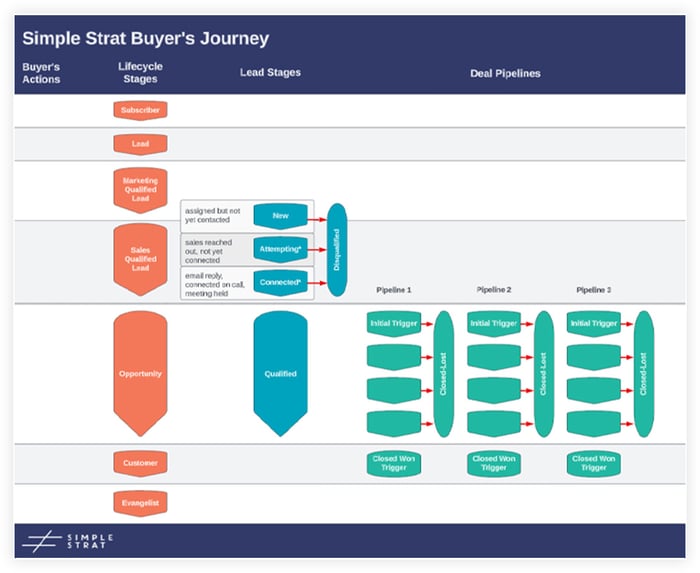
4. Poorly Defined User Journeys (or None at All)
The concept of a user journey governs all effective websites. It’s the path someone takes from entry to conversion. For example, if someone lands on your homepage and they have problem X, they should immediately find relevant information or a solution that addresses this issue.
This could be through a prominently displayed product that solves problem X, an informative blog post, or a direct call-to-action leading them to a service page. The key is to create a seamless and intuitive path that guides the user from recognizing their problem to finding and choosing the solution your website offers.
However, if this journey is poorly defined or convoluted, potential leads may feel lost or overwhelmed, leading them to exit your site without engaging further. Most people don’t take the time to study how their customers move through their site, or they’re making assumptions without actually talking to the customer. This leads to misaligned user journeys and hinders effective visitor conversion.
How to fix it
- Map out user paths: Start by mapping out typical paths you expect different user personas to take on your website. This can be something as simple as a whiteboard drawing or a Lucidchart. Identify their goals, pain points, and what information they need before they're ready to convert.
- Simplify navigation: Ensure your website's navigation is intuitive. Use clear, descriptive menu labels and a logical structure that guides visitors deeper into your site.
- Use clear visual hierarchy: Employ visual cues and content that direct users to the next step. This can include strategic placement of buttons, links, and calls-to-action. These elements work together to draw the user's attention to key information and actions, making the website more intuitive and navigable.
- Start simple, and build: Avoid overwhelming users with too much information at once. Start with the most important info and then reveal more detailed content as they delve deeper into your site.
- Optimize landing pages: Ensure each landing page is focused and aligned with the specific interests of the target audience it's intended to attract. Each page should have a clear call-to-action (CTA).
- Personalize user experiences: If possible, use personalization techniques to tailor the user journey based on the visitor’s previous interactions with your site.

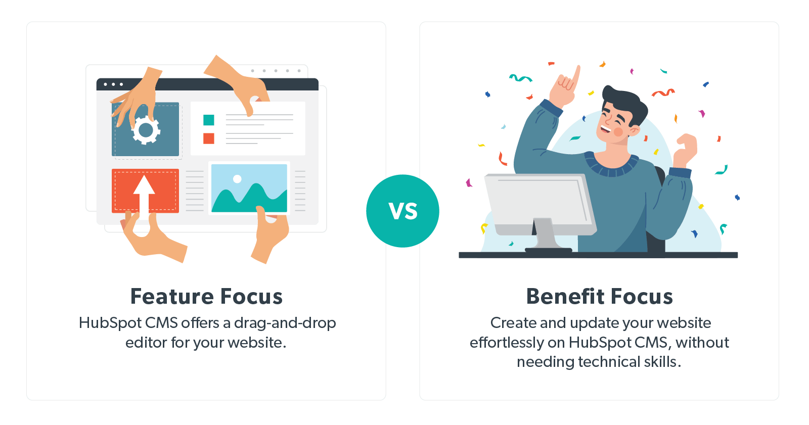
5. Way Too Much Talk About Features Over Benefits
There's a subtle yet significant difference between features and benefits. While features are the characteristics or specifications of your product or service, benefits are the outcomes or advantages that those features deliver to the client.
When people buy something, they’re looking to solve their problem, but they’re really looking for what life is like on the other side. One of the most famous examples here is that people don’t want a drill. They don’t even want a hole in the wall. They want to be reminded of the love for their family by viewing their family photo that gets hung on the wall as a result of the drill.
Now that’s quite the haul, but with the 10,000+ products on the market today for example just in the marketing technology space, you can’t afford to do feature comparison. Every tool has AI. That’s not a feature. But if you showcase the benefit (like the tool Sybill.ai does) you can show that it’s not about getting a meeting recording and notes. The benefit is you can spend more time on sales calls paying attention because the tool will actually listen and watch for buying intent and then summarize that for you in the end.
How to fix it
- Identify key benefits: Start by listing the features of your product or service. For each feature, ask, “What does this mean for the client?” Transform this into a clear benefit statement. For instance, if your software has a feature for automated data entry, the benefit could be saving time and reducing human error for the client.
- Use client-centric language: Frame your content using language that speaks directly to the client’s interests and needs.
- Highlight emotional benefits: Don't just focus on practical benefits. Emphasize the emotional payoff that your clients will get (which is arguably the problem they’re actually trying to solve). For example, if your service streamlines business processes, talk about the peace of mind or the sense of control it brings.
- Paint a picture for the customer: Use graphics, charts, or infographics to visually demonstrate the benefits. This can be particularly effective in simplifying complex features and illustrating their impact in a clear, engaging manner.
6. Lack of Credibility Signals
Credibility signals are powerful elements that showcase your expertise, experience, and the satisfaction of your past clients. It helps answer the question in the mind of the prospective customer: “Who are you and can I trust you to solve my problem?”
Establishing trust with potential clients is crucial, especially in the B2B sector where the resource cost for a purchase tends to go beyond the transaction itself (e.g. training or platform switching costs).
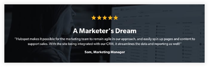
Without client testimonials, detailed case studies, or clear evidence of your expertise and accomplishments, your website may struggle to build the necessary trust with visitors. Remember, in the world of professional services, your reputation and the tangible results you've delivered are your strongest selling points.
How to fix it
- Incorporate testimonials: Add genuine testimonials from past clients that highlight specific benefits they've experienced from your services. Ensure these are easily visible on your website.
- Showcase case studies: Develop comprehensive case studies that demonstrate how you have addressed client challenges and delivered measurable results. Use a storytelling approach to make them compelling and relatable. Then add them to relevant pages of your site, like this.
- Highlight expertise: Feature awards, certifications, or recognitions that your company has received. Include articles, whitepapers, or blog posts that exhibit thought leadership in your field.
- Display trust badges: If you're affiliated with reputable industry bodies or have been featured in notable media outlets, display these badges prominently on your site. You’ll notice our HubSpot Diamond Solutions Partner badge display on some of our landing pages, for instance — consider what kinds of similar trust symbols you have in your industry.
7. Ineffective, Vague, or Buried Call-to-Actions (CTAs)
The call-to-action (CTA) is a crucial element of your website, serving as a guide for what you want the visitor to do next. If CTAs are unclear, missing, or unconvincing, you're missing out on converting visitors into leads.
A compelling CTA should be direct and engaging, clearly stating the action you want the user to take. It's not just about the words used; the design, placement, and visibility also play a significant role in its effectiveness.
How to fix it
- Be specific and action-oriented: Use strong, action-oriented words. Instead of generic phrases like "Click here," use specific instructions like "Download our Free Guide" or "Schedule Your Consultation."
- Create a sense of urgency: Phrases like "Limited offer" or "Get started today" can create a sense of urgency and prompt immediate action.
- Stand out with design: Make your CTA visually striking with contrasting colors or design elements that draw the eye. Often a best practice is to include it in the upper right hand corner of the navigation and the button is a different (yet consistent) color than other things
- Strategic placement: Place CTAs in locations where visitors naturally engage the most, such as beside key pieces of content or at the end of blog posts.
- Test and optimize: While most things on your site can be tested, this is especially true with CTAs. Use A/B testing to try different CTA versions and see which one resonates more with your audience.
One last note: Too many CTAs can also be an issue so make sure you're not giving someone "too many options" to choose from, or they may stall out altogether.
8. Lack of SEO Best Practices (Google Can’t Find It!)
Search Engine Optimization (SEO) is crucial for making your website visible to a wider audience. Unfortunately, we’ve seen companies overlook the importance of SEO, focusing solely on aesthetics and content only to want to “focus on SEO after the site launches” (mistake).
SEO starts with the site strategy, site structure and your plan for how the content will be discovered. Without SEO, even the most visually appealing and informative websites can remain hidden in the vast ocean of online content.
SEO involves a range of practices, from technical aspects, like improving site speed and mobile responsiveness, to content strategies, like keyword optimization and creating valuable content that resonates with your target audience’s searches. While AI tools like ChatGPT can make the SEO process easier, make sure you avoid making these common mistakes.
How to fix it
- Create and publish quality content regularly: Publish relevant, informative, and engaging content that addresses the queries and needs of your audience. If you know nothing about SEO, focus on this above all else.
- Research what your audience is searching for online: Identify the keywords your target audience is using and incorporate them naturally into your content.
- Optimize website structure: Ensure your site has a logical hierarchy, clear navigation, and is mobile-friendly.
- Improve page loading speed: Use tools like Google PageSpeed Insights to identify and rectify elements that slow down your site. If your site is slow, Google doesn’t want to serve it to visitors because it’s a bad experience.
- Utilize meta tags effectively: Craft compelling meta titles and descriptions with relevant keywords to improve click-through rates.
- Build quality backlinks: Garner links from reputable websites to enhance your site’s authority and search ranking.
9. Not Addressing User Pain Points, or Being too Vague
We’ve mentioned this a couple times now, but it deserves its own section. One of the key reasons a website might not be generating leads is its failure to address the specific challenges and pains of its target audience.
Every potential client visiting your site is looking for solutions to their unique problems. If your content is generic and does not speak to these specific issues, it fails to establish a connection or resonate with the visitor.
The key is not just to showcase what your services or products are, but to demonstrate how they can alleviate the specific pain points of your audience. This approach shifts the focus from what you offer to how you can solve their problems, making your website more relatable and engaging.
How to fix it:
- Identify common pain points: Conduct market research or gather customer feedback to understand the common challenges your target audience faces.
- Tailor content to address these issues: Revise your website content to directly address these pain points. Use language that empathizes with the visitor's challenges and illustrates your understanding. Greg Alexander of Collective54 has a great video about understanding how you can speak to the customers’ problems.
- Showcase solutions effectively: Highlight how your services or products provide solutions to these problems.
10. Ignoring Website Analytics
Understanding website analytics can help you identify what attracts visitors to your site and what keeps them engaged. By not analyzing website traffic and user behavior, you miss out on valuable insights into your website's performance.
Analytics provide a roadmap to what your audience finds appealing and where they might be dropping off, allowing you to fine-tune your website for optimal lead generation.
How to fix it
- Implement analytics tools: Start by integrating robust analytics tools (such as in HubSpot or Google Analytics). These tools are often user-friendly and provide comprehensive data on traffic, user behavior, and more.
- Regularly review data: Set a routine schedule to review your analytics. Look for trends in visitor behavior, such as the most visited pages, bounce rates, and the paths visitors take through your site.
- Make informed adjustments: Use the insights from the data to make targeted improvements. This might include tweaking your content, redesigning navigation for better user flow, or enhancing pages that have high traffic but low conversion rates.
- Monitor changes: After making changes, monitor the analytics to see how they impact user behavior and lead generation, and be prepared to iterate further based on these insights.
11. No Follow-up Strategy for Leads
This is a surprisingly common mistake. We’ve seen this far too many times to count. When leads are not nurtured or pursued with a systematic approach, they can quickly lose interest or turn to competitors, leading to missed opportunities for your business. Many businesses falter here due to the absence of a structured follow-up strategy.
Remember, generating leads is only half the battle; what really counts is how you engage with these prospects post-conversion. A well-defined follow-up process is critical in maintaining the momentum and interest of these potential customers.
How to fix it
- Implement an automated email sequence: Set up an automated email campaign that triggers once a lead is captured (HubSpot sequences are the perfect tool for this). This sequence should thank them for their interest, provide additional valuable information, and gently guide them to the next steps.
- Personalize your outreach: Whenever possible, personalize your follow-up communications. Use the lead's name, reference specific interests they may have shown, and tailor your message to address their potential needs or pain points.
- Regular follow-up intervals: Establish a regular schedule for follow-ups. This could be a series of emails, phone calls, or even personalized offers, ensuring you remain at the forefront of their minds without overwhelming them.
- Track and analyze lead responses: Use CRM tools to monitor how leads respond to your follow-ups. Analyzing these interactions can provide insights into the effectiveness of your strategy and areas for improvement.
12. Dated Design or Poor User Experience
Have you ever landed on a website but decided not to buy anything because the site feels like it was made in 2003? An awkward website design or a bad user experience can significantly deter potential customers, in part because people tend to associate a clean website with trustworthiness.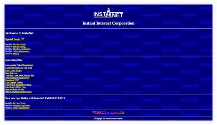
How to fix it
- Update design elements: Ensure your website has a modern, visually appealing design that aligns with your brand, and is consistent throughout the site. This includes using appropriate color schemes, fonts, and high-quality images. Make sure it’s clear what the most important elements are, and which are lower priority.
- Simplify navigation: Streamline your website’s navigation to make it intuitive and user-friendly. Clear menus, a well-structured layout, and a logical flow of content guide users effortlessly to the information they seek.
- Look into site design norms in your industry - if your industry tends to be a late adopter of technology or behind the trends, go look at ones that tend to be leading the pack, such as SaaS tools like HubSpot. You’ll quickly realize what visitors expect from a visual experience.
- Test user experience: Run some user experience tests to identify and fix any issues that users may face. This can involve feedback from real users or employing tools that simulate user interactions.
13. Terrible Mobile Experience
A site that's not optimized for mobile usage tends to have longer load times, distorted layouts, and navigation difficulties on smaller screens. This can frustrate mobile users, leading to a higher bounce rate and a significant decrease in potential leads.
You’ve probably heard the stat that mobile traffic is making up more of user behavior, up to 57.8% of global internet traffic according to some studies. There are two caveats to this. First, Americans are still more likely to be on desktop (the global stat is basically reversed in the US). Secondly, B2B customers are much more likely to access your site on desktop (presumably because they’re at work).
So does that mean you can ignore mobile? Sorry, but no.
Even if most of your users are coming to your site via desktop, search engines penalize sites that aren’t mobile optimized, leading to lower rankings. And if 1 or 2 out of 5 users are checking out your site on their phones, you don’t want to scare them off with a broken mobile site.
How to fix it
- Implement a responsive design that adjusts seamlessly to different screen sizes.
- Use design mockups: You have to account for how people will use your site, and nailing this down in the design and development phase is critical.
- Optimize images and media to ensure they load quickly and display correctly on mobile devices.
- Simplify navigation to be easily usable on touchscreens.
- Minimize pop-ups and ensure any forms are easy to fill out on mobile.
14. Not Showcasing the Expertise or People Behind the Brand
Establishing a personal connection can be as crucial as showcasing expertise. Potential customers often seek not just a service provider, but a partner they can trust and relate to. A website that fails to introduce the team or reflect the company's culture may come across as distant and unrelatable.
By not humanizing your organization, you risk creating an impression of a faceless entity, potentially deterring customers who value interpersonal connections.
How to fix it
- Introduce your team: Create a dedicated section on your website to introduce team members. Include professional photos and brief bios that highlight their expertise, roles, and a bit of personal background.
- Showcase your culture: Share insights into your company culture through blog posts, behind-the-scenes videos, or a gallery of office events. This gives a glimpse into the working environment and ethos of your company.
- Client testimonials: Include testimonials that mention specific team members, demonstrating the impact of your staff on client satisfaction.
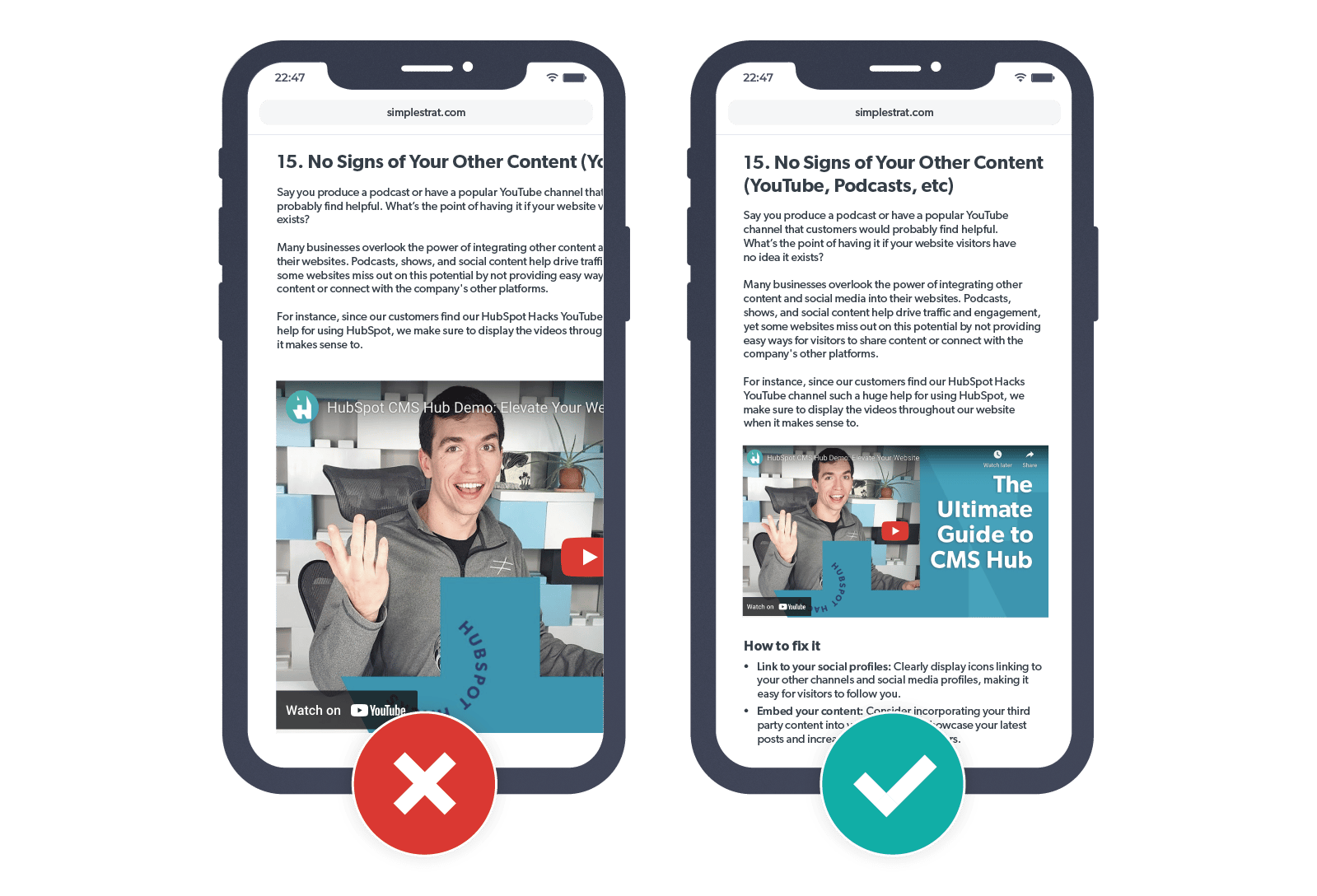
15. No Signs of Your Other Content (YouTube, Podcasts, etc)
Say you produce a podcast or have a popular YouTube channel that customers would probably find helpful. What’s the point of having it if your website visitors have no idea it exists?
Many businesses overlook the power of integrating other content and social media into their websites. Podcasts, shows, and social content help drive traffic and engagement, yet some websites miss out on this potential by not providing easy ways for visitors to share content or connect with the company's other platforms.
For instance, since our customers find our HubSpot Hacks YouTube channel such a huge help for using HubSpot, we make sure to display the videos throughout our website when it makes sense to.
How to fix it
- Link to your social profiles: Clearly display icons linking to your other channels and social media profiles, making it easy for visitors to follow you.
- Embed your content: Consider incorporating your third party content into your website to showcase your latest posts and increase subscribers/followers.
- Have a dedicated media page: Create a dedicated section or page on your website for your media content. This could be labeled "Podcast", "Videos", or "Media Center", providing a one-stop-shop for all your multimedia content.
- Promote it in a newsletter: If you have a newsletter, regularly feature your podcast or YouTube content in it. Provide direct links to the latest episodes or most popular videos.
Looking to turn your website into more of an asset?
Simple Strat specializes in harnessing the power of HubSpot to transform your website into a growth engine for your business. We’ll integrate HubSpot's scalable solutions — from SEO and advanced AI tools to integrated CRM capabilities — to ensure your website not only grows with your business but also maximizes lead generation effortlessly.
Speak to Simple Strat today and discover how we can tailor HubSpot’s all-in-one CMS to your unique business needs, with content that resonates with your audience and drives your business forward.
