

How would you classify your website - is it a sales and marketing engine powering your growth? is Or merely a digital placeholder on the web?
Unfortunately, many of the websites in today's B2B market are still falling short. They might look pretty, but they're not driving significant volume of leads or supporting sales in the way that they should. It's not high-converting website. It's actually not converting much at all.
What's worse though, an underperforming website can cost you countless potential customers , allowing competitors to gain an advantage.
So how do you create a website that does that? One that offers an engaging user experience, is optimized for conversions, and clearly communicates your unique value?
In this article, we're going to dive into the makings of a high quality website, site structure, the type of content you need, and how it all fits together into an easy-to-follow framework. Let's go!
Quick note: Want to skip the content and chat with our website strategists? Book a free consultation.
Table of Contents
- Homepage
- About Page
- Service Pages
- Lead Capture Forms
- Clear Calls to Action (CTAs)
- Blog Posts
- Portfolios/Profiles/Case Studies
- FAQ Page
- Pricing Page
PART 1: PLANNING YOUR SITE
Before you build a website or revamp your current one, you need to determine what you want the final product to look like and how you want it to function.
That means figuring out not just the look and feel of the site, but its purpose, structure, and how you want your visitors to interact and move through their experience - ultimately resulting in the outcome (whether that's form submission, reading content, joining a webinar, getting a demo, etc).
Component #1: Clear Purpose for Website
What it is: Every website should have a definitive goal or main objective, such as generating leads, selling products, or providing information. The purpose and foundational idea are the north star for your website's design, content, and functionality.
Why your website purpose matters: A website with a clear purpose effectively guides visitors towards the desired action, whether it's making a purchase, signing up for a newsletter, or contacting your organization for services. It shapes user experience by providing direction and focus, ensuring that visitors are not lost or overwhelmed. A website with a well-defined purpose is more likely to rank well on search engines, as its content and structure are optimized around specific goals.
What your website purpose should include:
- Identify and articulate the primary goal (e.g., lead generation, sales).
- Align the elements of the site with this purpose.
- Regularly evaluate website performance against this goal.
What to avoid: Don’t dive right into building a website without a plan in mind. Otherwise, your site will be ineffective at just about everything.
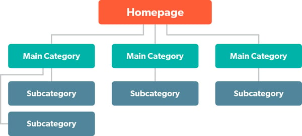
Component #2: Clear Page Hierarchy
What it is: Your page hierarchy refers to the structured organization of web pages within a website. This includes how individual pages are laid out and how they are interconnected through navigation. The hierarchy guides users in understanding the relationship between different content sections and the overall structure of the site.
Why website page hierarchy matters: A well-defined page hierarchy improves user experience by making it easier for visitors to navigate the website and find the information they need. It also enhances the website's SEO as search engines can more easily crawl and understand the structure and content priority, leading to better indexing and search rankings.
Tips for Clear Page Hierarchy:
- Organize content logically: Structure your website in a way that flows naturally. Main categories should lead to subcategories in a way that makes sense to the user.
- Use breadcrumbs: Breadcrumbs are navigational aids that show users their current location in the website’s hierarchy and how they got there. This helps in navigating complex websites with multiple layers.
- Consistent navigation: Maintain consistent navigation across all pages. This includes a fixed menu bar or sidebar that remains the same throughout the user's journey on your site.
- Everyday language: Gone are the days of cutesy page names and programs. Make sure to name your pages and products according to what people are searching for.
What to avoid: Avoid a cluttered or confusing structure where pages seem randomly placed without logical connections. This can lead to a frustrating user experience and may increase bounce rates (the percent of visitors who leave the site after only viewing one page). Not to mention, disorganized or hidden pages are unlikely to rank in search results!
Component #3: Intuitive Navigation and a Good User Experience
What it is: These terms refer to a website design that makes it easy for users to find what they are looking for without confusion or delay. This ties into the page hierarchy mentioned above, as it includes a well-organized structure, along with logical placement of elements, and clear labels.
Why navigation and user experience matters: Effective navigation is crucial for a good user experience. It allows visitors to easily interact with your site and find the information they need quickly, without getting impatient or frustrated. A website that is easy to navigate and understand keeps users engaged longer, reduces bounce rates, and increases the likelihood of conversion. Moreover, a positive user experience can enhance brand perception and loyalty.
Other elements that influence website user experience:
- Good pagespeed: People online don’t like to wait. Even 5 seconds, a relatively fast period of time, seems like an eternity on the web. Fast-loading pages keep users engaged and reduce bounce rates, as well as significantly improving the overall user experience. Test your pages with Google PageSpeed Insights and follow their recommendations to speed up your site. Other aspects that influence pagespeed include what content management system you use to build the site. For example, themes from the Wordpress marketplace can come loaded with lots of functions and bloat the slow down your site - which often has to be remedied with technical methods. HubSpot CMS on the other hand, loads quickly and delivers higher pagespeed out of the box, leaving you to focus on other things.
- Accessibility: Implementing accessibility features ensures your website is usable by all people, including those with disabilities, thereby broadening your audience reach.
- Typography and color schemes: Well-chosen typography and color schemes not only strengthen brand identity but also contribute to the readability and visual appeal of your website.
- Security: Robust website security measures protect against cyber threats, safeguarding both company and user data.
- Effective Footer: A footer acts as a secondary navigation tool, offering quick access to essential information and resources on your website. A strong footer typically includes contact information, quick links to major pages, social media icons, a newsletter signup, and legal information such as terms of service and privacy policy.
Strengthen your user experience with these tips:
- Logical layout of menus and categories: Organize your site’s content into clear, easy-to-understand categories and subcategories. Ensure that menus are easily accessible and self-explanatory.
- Minimal clicks to reach desired information: Streamline your site’s structure so that users can get to their desired destination in as few clicks as possible.
- Easy-to-find search function: If you have a lot of content, you may want to incorporate a (prominent) search bar that allows users to quickly find specific content or information on your site.
- Responsive design: Make sure your website automatically adjusts to fit various screen sizes, which will improve user experience and help your site’s SEO. Use flexible grids, prioritize content based on the device, and regularly test on multiple devices. A good CMS will help you make your site mobile friendly by default.
What to avoid: Overly complicated menu structures and navigation paths that can confuse users. Avoid hidden menus or elements that require explanation, as these can significantly hinder the user experience.
PART 2: WEBSITE CONTENT
Homepage
Purpose of Your Website's Homepage: The homepage of a website serves as the digital front door to your business. It's typically the first page that users encounter when they visit your website, so it’s extremely important to get it right. The homepage should effectively showcase your brand's identity, message, and core values. It is designed to be an overview of what your business offers, giving visitors a clear understanding of what you do and how you can meet their needs. Additionally, it serves as a navigational hub, directing visitors to other important areas of your site.
Why it matters: The homepage is crucial because it sets the first impression for your site visitors. A well-designed homepage can establish credibility and trustworthiness. It also plays a pivotal role in reducing bounce rates by engaging visitors immediately with compelling content and clear navigation. Your homepage is your opportunity to captivate your audience, communicate your unique value proposition, and guide them deeper into your website, whether that's to learn more about your services, make a purchase, or get in contact with you.
What to Include on Your Homepage:
- Clear brand messaging: Use concise and compelling language to communicate what your business does and what makes it unique. Your homepage should reflect your brand's voice and tone.
- Strategic layout and design: Ensure the design is visually appealing and aligns with your brand. Use a clean layout with a balance of text and visuals.
- Highlight primary call-to-action (CTA): Your CTA should be clear and compelling, encouraging visitors to take the next step, whether it’s making a purchase, signing up for a newsletter, or contacting your team. Read more on CTAs further down.
- Engaging copy: Make sure you have informative yet persuasive copy that resonates with your audience. Use clear language that speaks to visitor needs and highlights your value.
What to avoid: Don’t clutter your homepage with too much information or too many images. This can overwhelm visitors and detract from your main message. Also, refrain from using jargon or vague statements that don’t clearly communicate what your business offers.
About Page
Purpose of Your About Page: The About Page is a dedicated section on a website that provides comprehensive information about a company.
Especially for service-based businesses (and small companies), the about page is often the highest viewed page beyond the homepage. It should answer 2 key questions:
- Who are you?
- Can I trust you to solve my problem?
The About Page typically includes details about the company's mission, vision, history, team members, and other aspects that shape its identity and values. This page serves as a narrative that offers insight into the company's core principles and its journey, giving a face and personality to the business.
Why it matters: Contrary to what some expect, an About page isn’t just a filler page. An effective About Page is crucial for establishing credibility and building trust with your audience, as it allows visitors to get to know your company beyond just the products or services you offer.
This connection is vital in today's market, where consumers often make choices based on their alignment with a company's values and story. A well-crafted About Page can also set you apart from competitors by highlighting your unique history, philosophy, and team, thereby humanizing your company and making you more relatable.
What to Include On Your About Page:
- Tell a compelling story: Narrate your company’s history and evolution in a way that is engaging and relatable. Highlight milestones and challenges overcome, as these can resonate with your audience and showcase your resilience and growth.
- Showcase your team: Include profiles or brief bios of key team members to give a face to your company. This can create a personal connection with your audience and showcase the expertise and diversity within your organization.
- Align with your brand's voice: Ensure that the tone and style of your About page reflect your overall brand identity. Whether professional, quirky, or inspirational, the voice on the should be consistent with the rest of your website and marketing materials.
What to avoid: Don’t be overly formal or simply list facts. This is your chance to connect on a personal level, so a lack of personality or storytelling can result in a missed opportunity to engage with your audience. Additionally, steer clear of overloading the page with too much text or technical jargon that might overwhelm visitors.
Service Pages
Purpose of Your Services Pages: Service pages are dedicated sections on your website that clearly describe the services you offer. Service pages are specifically designed to inform visitors about your services, their benefits, and how they can be purchased.
- To illustrate this point: View this example of a service page
Why it matters: Service pages play a crucial role in converting visitors into customers. They provide detailed information about what your company offers, helping visitors understand how these services can meet their needs. Well-crafted service pages can effectively showcase the value of your services, build trust, and encourage engagement.
Best Practices for Effective Service Pages:
- Segment your pages: If you have multiple services/products, or different audiences for the same service, consider how you can make unique pages for each.
- Detailed descriptions with clear benefits: Each service page should offer comprehensive information about the service, focusing on how it solves problems or adds value for the customer. Highlighting benefits rather than just features helps potential clients understand the tangible outcomes they can expect.
- Incorporate testimonials and case studies: Include real-life examples, testimonials, or case studies that demonstrate the effectiveness of your services. This social proof can significantly boost credibility and help potential customers relate to the success stories of others.
- Seamless navigation from homepage to service pages: Ensure that visitors can easily find service pages from your homepage. Use clear menu labels, and consider featuring key services on the homepage with direct links to their respective detailed pages.
What to avoid: Vague or overly technical descriptions that might confuse visitors. The goal is to communicate the value of your services in a language that your target audience understands and relates to.
Also, ensure that service pages are not buried deep within the website structure, making them hard to find – this can lead to missed opportunities for engagement and sales.
Lead Capture Forms
Purpose of Lead Capture Forms: These are specific types of forms on your website that help gather visitor information, such as names and email addresses, turning visitors into potential leads.
Below is an example of a lead form used to capture top of funnel leads from a download for a growth guide.

Why it matters: You never want to leave a visitor wondering how to contact you or hear more from your business. These forms convert website visitors into leads, which is essential for building a customer base and driving sales. They're a key touchpoint for user engagement and information collection.
Tips for Effective Lead Forms:
- Keep it simple: Request only necessary information to increase form completion. Most research suggests 4 to 5 fields for top of funnel conversion, such as ebooks, webinars, etc. For bottom of funnel or more sales-specific activity, more forms are acceptable but also help qualify the lead for the sales team and lead to more specific follow up. Always balance brevity with the need for the right information.
- Visible placement: Place forms in noticeable areas like the top of the homepage or end of blog posts.
- Offer incentives: Provide value like exclusive content to encourage submissions.
What to avoid: Overly long forms with excessive information requests can deter users, as can unclear instructions or complicated validations. If this information is essential, you can always ask for it later.
Clear Calls to Action (CTAs)
Purpose of Calls to Action (CTAs): CTAs are direct prompts or instructions on a website that guide users towards a specific action, such as signing up for a newsletter, downloading a guide, purchasing a product, or contacting for more information. All lead capture forms will have a CTA, but not every CTA is a lead capture form (e.g., CTAs to call a number or purchase a product). Most businesses will have CTAs on their homepage which direct the visitor to relevant service pages.
CTAs are typically presented as buttons, links, or graphical elements that stand out from the rest of the page content. They serve as clear signposts for the user, indicating the next steps they can take to engage more deeply with the website or company.
Why it matters: Clear CTAs are pivotal in guiding your website visitors towards taking desired actions. Effective CTAs transform passive browsers into active participants, directly influencing conversion rates and the overall success of your website.
Tips for Effective CTAs:
- Use action-oriented language: Your CTA should use strong, commanding verbs that encourage immediate action, create a sense of urgency and importance. Phrases like "Buy Now," "Sign Up Today," or "Download Free Ebook" are good starting points, though ideally you want it to convey the specific benefit they receive by following the link.
- Make CTAs stand out visually: CTAs should be visually distinct from the rest of your website's design to catch the user's eye. Do this with things like contrasting colors, bold fonts, or buttons that pop out against the background. Remember, the goal is to attract attention without being disruptive to the overall aesthetic of the site.
- Place CTAs strategically throughout the website: Position your CTAs in locations where users are most likely to take action. This includes near compelling content, at the end of blog posts, or alongside product descriptions. However, be cautious of overwhelming your visitors with too many CTAs.
What to avoid: Don’t use vague or generic language in your CTAs, like "Click Here," which does not specify the action or its benefit. Also, steer clear of placing CTAs in locations where they can be easily missed or mistaken for ads.
Also, overloading your website with too many CTAs can be counterproductive, as it may confuse or overwhelm visitors. When there are too many options, research shows the prospect is actually LESS inclined to take action.
Blog Posts (Articles)
Purpose of Blog Posts (or Articles): Blog posts are a huge opportunity to provide insights, information, or commentary on various topics and demonstrate your industry authority. In a B2B context, blog posts often focus on industry trends, expert advice, and solutions to common challenges faced by businesses in that sector.
Why it matters: Blog posts are a vital component of B2B marketing strategies. They serve as a platform for businesses to demonstrate subject matter expertise and thought leadership. This content not only helps in building trust with current and prospective customers but also plays a significant role in inbound marketing efforts.
By offering valuable, informative, and engaging content, blog posts attract potential clients, retain existing ones, and improve search engine rankings. They also offer an opportunity for businesses to address customer pain points, answer frequently asked questions, and provide insights into industry best practices.
Tips for an Effective Company Blog:
- Focus on quality and relevance: Ensure that your blog posts are well-researched, informative, and relevant to your target audience. Quality content helps in establishing your brand as a credible source of information.
- Include author information on your blog: Because of the amount of content that is increasingly written with AI, it's critical that the expertise and personalities behind the content are used as part of your content strategy. Showcase authorship and the person's credibility in creating that content.
- Regular updates: Keep your blog updated with regular posts. Consistency in publishing fresh content keeps your audience engaged and helps with SEO.
- Use a CMS that makes posting easy: A strong content management system (like the CMS offered by HubSpot) makes it easy to write, design, and distribute content quickly, and with consistent quality. HubSpot’s built-in AI tools also make writing blogs a breeze.
- Incorporate SEO best practices: Utilize researched keywords, meta descriptions, and compelling titles to optimize your blog posts for search engines, making them more discoverable to your target audience. Just don’t let emphasis on keywords distract from making your blog clear and helpful!
- Include as part of a larger resource center. If a blog doesn’t make sense for your audience or your customer acquisition strategy, consider providing a resource center, such as a knowledge base built around answering common questions your customers ask you.
What to avoid: Don’t create content that is overly promotional or sales-focused, as this can diminish the trustworthiness of your blog. Steer clear of topics unrelated to your industry or your audience’s interests. Don’t just churn out derivative posts either: make sure you’re always adding your own expertise and insight to make your posts as original as possible, or find ways to make your content better than what’s already out there.
Portfolios/Profiles/Case Studies - Social Proof Content
Purpose of Social Proof content: Profiles, portfolios, and case studies are comprehensive presentations of a business's previous work. For example, with SaaS companies and service-based industries, these assets showcase things like software capabilities, implementations, and outcomes. Case studies delve deepest, narrating the story of a client problem, the solutions provided, and the results achieved. They often include client testimonials, data metrics, and detailed project descriptions.
Why it matters: Portfolios and case studies are vital tools for demonstrating your company's capabilities and successes in real-world scenarios. They offer tangible proof of your expertise and build trust with potential clients. By seeing the direct impact of your services or products, prospects can better understand and relate to what you offer. This transparency is crucial for SaaS and service-based businesses where the product or service outcome isn’t immediately tangible.
Tips for Including Social Proof on Your Website:
- Dedicated page: Put these resources on their own web page so they’re easy to find, rather than burying them with blogs, news, or other content on your site.
- Showcase diverse examples: Include a variety of projects to demonstrate the range of your capabilities. For case studies, select examples that highlight different challenges and solutions to show your versatility and expertise.
- Detail the process and outcome: Clearly outline the client's initial challenge, your proposed solution, and the final outcome. Include quantifiable results such as performance metrics or ROI to validate your success.
- Incorporate client testimonials: Use direct quotes or video testimonials from clients within your case studies. This adds a layer of credibility and relatability, showing prospective clients that others have trusted and benefited from your services.
What to avoid:
- Vagueness in descriptions: Avoid general or vague descriptions of your projects. Be specific about the challenges, solutions, and results to give a clear understanding of your capabilities.
- Outdated or irrelevant projects: Regularly update your portfolio and case studies to reflect your most current and relevant work. Outdated examples might not accurately represent your current skill level or service offerings.
- Overly technical language: While it's important to be detailed, avoid overly technical jargon that might confuse potential clients who are not experts in your field. Strive for clarity and simplicity in your descriptions.
FAQ Page
Purpose of an FAQ Page: A Frequently Asked Questions page should answer common questions that users might have (rather than just the things you want customers to know, a common mistake) This page usually addresses fundamental and specific queries about the company's services, products, policies, or general operations.
Why it matters: An effective FAQ page provides instant answers to common questions, reducing customer service workload and increasing operational efficiency.Plus, a well-crafted FAQ section can be an excellent tool for addressing sales objections and uncertainties, potentially removing barriers that might prevent a visitor from making a purchase or signing up for a service.
Tips for an Effective FAQ Page:
- Identify common questions: Regularly gather feedback from customer service interactions, social media, and product reviews to determine which questions are most frequently asked by your audience.
- Give clear and concise answers: Provide straightforward and easy-to-understand answers. Avoid industry jargon unless your target audience is familiar with it. Each answer should directly address the question without unnecessary details.
- Organize for easy navigation: Group related questions together and use a clear, logical structure for your FAQ page. Consider using collapsible text or an index with anchor links for longer FAQ pages to make navigation more user-friendly.
What to avoid: Don’t make a generic FAQ page that doesn't actually address the specific concerns and questions of your target audience. On the flipside, overloading your FAQ page with too much information or unrelated content can overwhelm visitors and detract from its usefulness.
Additionally, neglecting to update your FAQ page regularly can lead to outdated or incorrect information, which can frustrate users and harm your brand's credibility. Lastly, avoid making your FAQ page hard to find; ensure it is easily accessible from your website's main navigation or footer.
Pricing Page
Purpose of a Pricing Page: While not necessary for every industry, in general a pricing page is where you can detail the cost of products or services, outlining various pricing structures, packages, and any additional charges or discounts. This is a critical component for transparency and clarity in B2B transactions, and a straightforward way to show the customer what they receive from you.
Why it matters: Essential for B2B businesses, a pricing page sets clear financial expectations, aiding in lead qualification and accelerating the decision-making process. It underscores transparency, aiding in building trust with potential corporate clients, and highlighting the value proposition of the services offered.
Tips for an Effective Pricing Page:
- Tiered pricing options: Depending on your offering, it will probably make sense to offer multiple pricing tiers to cater to different segments of your market. Each tier should be clearly differentiated in terms of value and features.
- Highlight value propositions: Alongside each price, detail what is included in the package and the value it offers. This could include service features, benefits, customer support, etc.
- Transparency about additional costs: Be upfront about any other expected costs, such as setup fees, maintenance costs, or optional add-ons. This prevents surprises and builds trust.
- Custom pricing: If you offer a product or service that needs custom pricing for higher-value offers, such as an “Enterprise Plan,” you may want to include a tier explaining it.
What to avoid: Steer clear of hiding the pricing page or complicating its structure, as this can lead to confusion and deter potential clients. Avoid non-disclosure of additional fees or costs, which can harm trust and damage your brand’s reputation.
PART 3: HOSTING AND SETUP
Choosing the Right Platform to Host Your Site
Picking the best platform for hosting your website is an important step if you want to build a high-converting site. At Simple Strat, we’re big proponents of using HubSpot CMS (now Content Hub) to run websites, though there are many different platforms to choose from on the market today.
Here are just a few reasons why we recommend HubSpot:
- User-friendly interface: Intuitive design tools are suitable for all skill levels, simplifying content creation and management and reducing the need for technical expertise.
- Integrated marketing tools: HubSpot’s seamless CRM integration helps you turn your website into a conversion machine, with efficient inbound marketing and lead management capabilities.
- Personalization capabilities: Tailor your content based on visitor data to enhance user experience and conversion rates.
- High Performance and Reliability: Reliable hosting with a globally distributed CDN for fast page loading and uptime.
- Built-in SEO and content strategy tools: Assist in higher search engine rankings and organized content.
- Simple yet robust marketing automation: Streamline tasks for a cohesive user journey while reducing repetitive tasks.
- Comprehensive analytics: Track website performance and visitor behavior to make more informed decisions.
- Customer lifecycle nurturing: Increase customer lifetime value through effective lead nurturing.
- Extensive ecosystem: A marketplace with tons of integrations and add-ons.
- Educational resources and community support: Access to educational content, a community forum, and customer support.
Whether you’re building a new website from scratch, or want to migrate from your existing platform, Simple Strat can get you up and running with a HubSpot-based website, designed with the systems in place that are proven to get results.