Getting the most out of your advertising budget is more than just clicking boost on your Facebook posts. Optimizing the text (copy), images, and audiences is the key to success.
But it’s not just typing in the most descriptive words and using any photo. Facebook sets up some pretty strict guidelines that can throw a wrench in your ads. We’ve got an entire post that goes over those guidelines so today we’re going to focus on what a successful health, wellness, and fitness ad looks like!
Types of Ads
Before we dig into the examples, let’s go over the different types of ads. Facebook offers six different ad formats for you to choose from, based on your goals.
- Photo Ads: Singular photo to convey your message. These are great for simple awareness posts.
- Video Ads: These are our favorite, they’re more engaging and work great for encouraging an action on your ad.
- Carousel Ads: These are the best of both above. You can add 3 photos and videos to a single ad post to tell a story and persuade your audience.
- Slideshow Ads: Use well-performing photos from your page and create a slideshow for people to learn more about your brand.
- Collection Ads: These are for businesses that are selling tangible products. Showcase multiple products in a single ad to encourage people to purchase, straight from the ad.
- Canvas Ads: These are ads designed for mobile that, when clicked, take you to a fullscreen landing page built within Facebook. They can be added to ANY format above (i.e. you can create a fullscreen canvas video ad).
Need some help figuring out the size of different ad types before you get started? Check out the Facebook image sizing guide with templates from our friends over at Adobe Spark.
Facebook Ad Examples
We’ve included a few of our favorite ads in each format so that you can get a good idea of what you can create. Let’s get started!
Photo Ads:
When you’re using a singular photo for a paid post on Facebook, you want to make sure you’ve got a million-dollar photo. Meaning something that portrays exactly what you want and that will cause your audience to stop scrolling. From simple and breathtaking photographs to edgy and exciting, there’s plenty of different options for you to reach your audience. We’ll look at a few examples below to walk you through these points.
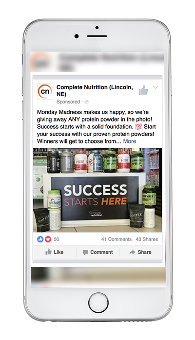
Why this works:
- It's visual. This photo shows off their products and grabs your attention with a bold statement.
- It's relevant. It's relevant to their audience because Complete Nutrition always runs this contest on Mondays - their audience is expecting this post.
- It's valuable. Complete Nutrition makes the action worth it by giving away any of the products shown in the photo.
- It has a solid call-to-action. This ad is set up to drive engagement by encouraging viewers to comment on the post.
Here’s another example from our Social Media Ad contractor, Doug Frasier
Why this works:
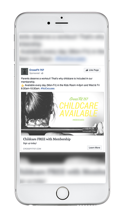
- The copy. The ad has short, relevant text, an intriguing picture that will cause you to stop and read, and headlines that are focused directly on their audience.
- It's visual. The photo is a shot that will cause you to stop and try to figure out what’s going on.
- The audience. This ad is set up to focus on parents who need childcare so they can go workout. This is called out directly in the photo and explained more in the copy.
Video Ads:
Why this works:
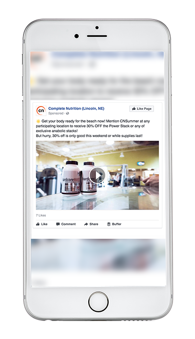
- The video. Videos are the strongest medium you can use in your ads. This video is also short enough to not bore viewers + can be watched without any sound. HUGE BONUS
- The copy. This video ad has strong copy that includes an in-store offer.
- The objective. This ad was optimized for page likes and awareness by using one of their popular products. The ad is directed at men and uses a masculine male as the subject of their video.
Why this works:
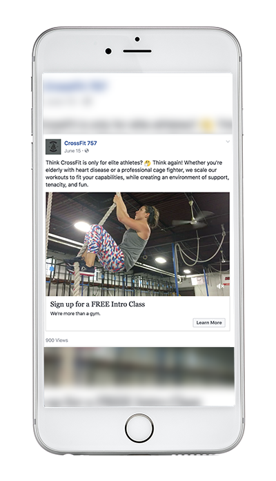
- The video. This ad is a cinemagraph video - meaning only one part of the shot is actually in motion. (click the photo to see the ad in action!)
- The copy. The copy in this ad is direct, yet encouraging, allowing veiwers to relate to the ad and be more likely to take action.
Carousel Ads:
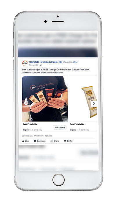
Why this works:
- The photos. The ad uses three different product shots to promote the offer of this particular protein and meal replacement bar giving viewers the ability to see exactly what they’d be getting. With a mix of authentic photos and product shots, this ad is easy for audiences to see what they’re getting.
- The copy. The copy is simple and to the point, driving customers to see how they can get their own free bar
Slideshow Ads
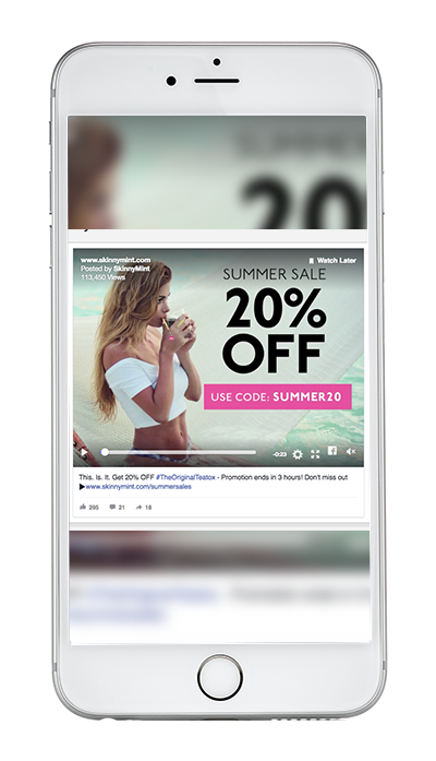
*Ad from Adspresso Examples post
Why this works:
- The creative. This slideshow is eye-catching, yet very authentic because most of the photos used are end-user photos that were sent in to the company.
- It's valuable. SkinnyMint uses a promotion to drive engagement and encourage their audience to take action.
Collection Ads
We were able to find this ad from Adidas to show off the features of a collection ad. These would beneficial if your gym had different class options people could buy online or if you’re a supplement store you can feature your products in a collection ad.
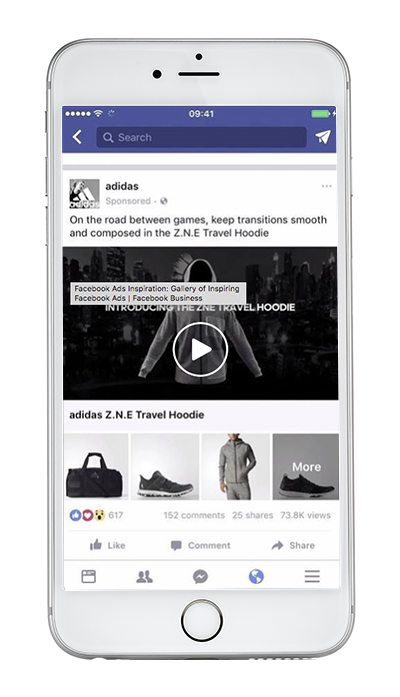
*Ad from Adspresso Examples post
Canvas Ads
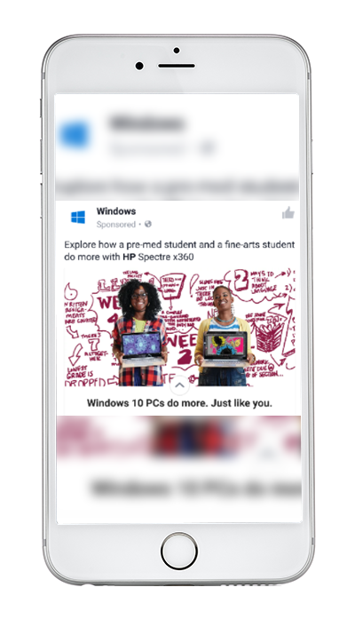
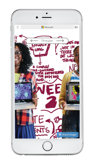
Canvas ads look like a regular post, but turn into a full screen experience when clicked. They load instantly, are mobile-optimized, and designed to capture the complete attention of your audience. With Facebook Canvas, people can watch engaging videos and photos, swipe through carousels, tilt to pan, and engage - all in a single ad.
This Microsoft example shows how your ad transforms from one small post to the full screen story.
Now that you've seen a few Facebook ad examples to inspire you, get out there and start advertising!
From marketing automation to a more productive sales team, HubSpot has established itself as the foundational platform for driving business growth — it even integrates with Facebook Ads for easier tracking and managing of leads. Learn more about buying HubSpot in our free guide.


